Bank Hapoalim

Credit Card Application Flow

Background

This project was part of a collaboration between Google & Reichman Tech School and Bank Hapoalim, aimed at bridging design education with real-world business challenges. Our team was invited to explore and redesign a key customer journey within Israel’s largest bank: ordering a credit card through the mobile app. The challenge was both educational and practical — transforming a complex, transactional flow into a seamless and supportive user experience.

Introduction:
From Classroom to Real Impact

This project began not in Figma — but at the source. As part of the Google & Reichman Tech School program, we were invited into the heart of Bank Hapoalim to explore the real-world challenges behind digital banking. After a lecture on Israel’s financial systems and credit infrastructure, our team was tasked with a mission:

”How might we transform the mobile credit card ordering experience into something seamless,
personal, and empowering?”

1. Immersion & Understanding the Problem

We started by mapping the existing flow, then stepped into the shoes of real users. Conversations, competitive benchmarking, and product deep-dives uncovered a number of pain points that made the experience feel frustrating and disconnected.

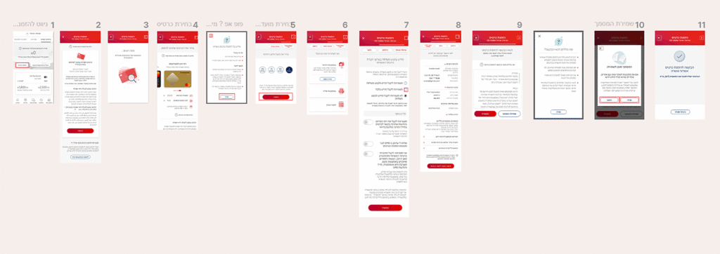
Hidden Onboarding process details
No timeline or requirements

Identical-looking Card Selection options
No personalization

Fixed Billing Dates No Financial Guidance

Complicated Delivery Issues Approval Issues, Strict Methods

2. Market Insights: Local & Global Inspiration

To reimagine the experience, we studied global leaders like N26, Revolut, Monzo, and Starling, alongside local competitors such as Discount Bank, Leumi, and Mizrahi-Tefahot.

3.Testing a Hypothesis: Do Tags Improve Experience?

We came up with the idea to personalize the credit card selection process by letting users choose interest-based tags. This would allow the system to recommend cards more relevant to their lifestyle and needs. To test this hypothesis, we created two versions of the flow:

Flow A:

A familiar version showing a generic list of cards

Flow B:

A personalized version, where users selected interest tags before receiving tailored card suggestions

We conducted A/B testing with over 20 participants. The results exceeded our expectations — an overwhelming majority of users preferred the personalized flow and said it made choosing a card easier, faster, and more relevant.

Real User Feedback:

“I liked that it’s personalized. I don’t need to read all the comparisons – I just choose what matters to me.

“It feels like the bank understands me – I say what I want, and it gives me a solution.”

“I’m a student and don’t understand credit cards – this way it’s simple and easy.”

4. Final Design Highlights

  • Intro & Progress: Friendly intro screen with 3-step visual roadmap

  • Tag-Based Personalization: Let users tell us who they are — we handle the complexity

  • Card Selection: Lifestyle-based visuals, clear benefits, and confident copywriting

  • Billing Date Guidance: Smart defaults + contextual explanations

  • Direct Debit Prompt: Subtle nudge to make this the primary card

  • Digital Wallet Integration: No skip — just flow

  • Approval & Confirmation: Calm, clear finish that reinforces trust

5. Presenting to the Bank

As a culmination of our work, we had the unique opportunity to present our project not only within the academic setting, but also directly at Bank Hapoalim.
Sharing our solution with senior leaders and department heads gave us valuable feedback — and confirmed the relevance and impact of our approach within the organization.