Drive - UberEats

An Economic Feature for Couriers

Background

As part of the Google Reichman’s Tech School UX program, our team was tasked with designing a feature to enhance financial planning for Uber Eats couriers. This initiative aimed to drive both courier earnings and Uber’s business performance by providing a data-driven approach to income management.

My Role

UX/UI Designer on a Team of 5
(Bar Avizemer, Omer Fefer, Noy Goldenberg, Lora Sror)

Timeline

5 weeks / December – January 2024

Process

Design Research – Empathizing – Ideating –
Designing – Usability Testing

“How might we help couriers at work set financial goals and achieve them?”

Final Prototype

Our prototype provides an intuitive and seamless experience for Uber Eats couriers, allowing them to set financial goals, track earnings, and adjust targets effortlessly.

997eed_d63995a9e9c144f6957bfc8d2ba44ef8~mv2

Collaboration & Teamwork

Seamless communication was at the heart of our team’s success. From the initial kickoff meeting, we established a clear workflow and open communication, ensuring that everyone stayed aligned throughout the process. We strategically divided tasks based on individual strengths while maintaining collaborative involvement in every phase – from research and ideation to prototyping and testing. This approach not only optimized efficiency but also fostered a shared sense of ownership, leading to a well-rounded and impactful design solution.

1. Research

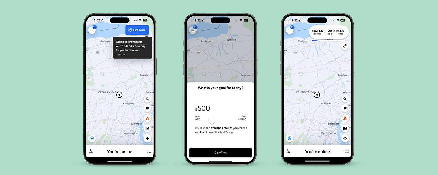
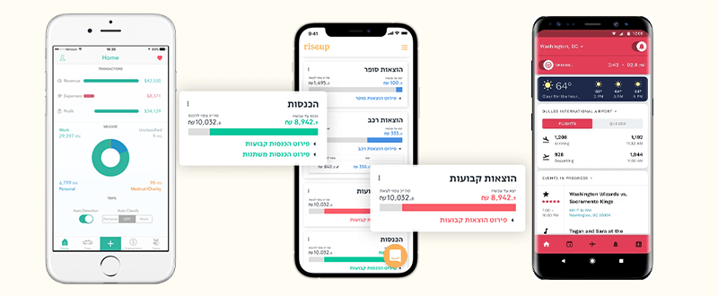
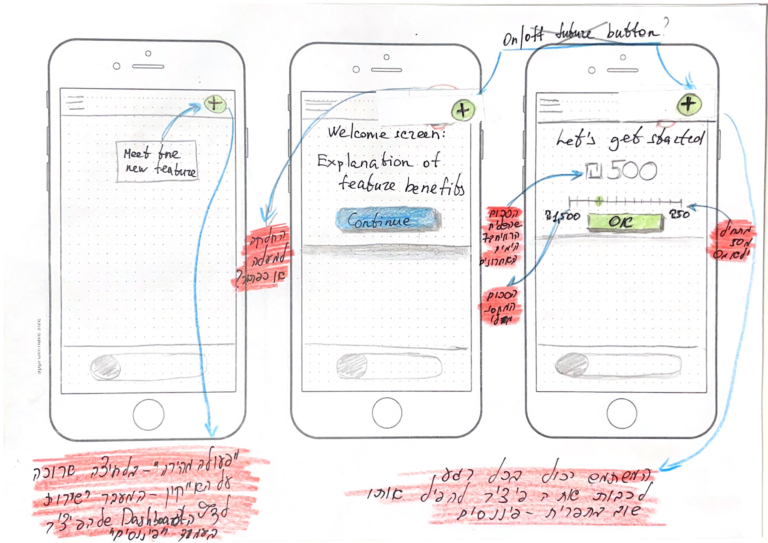
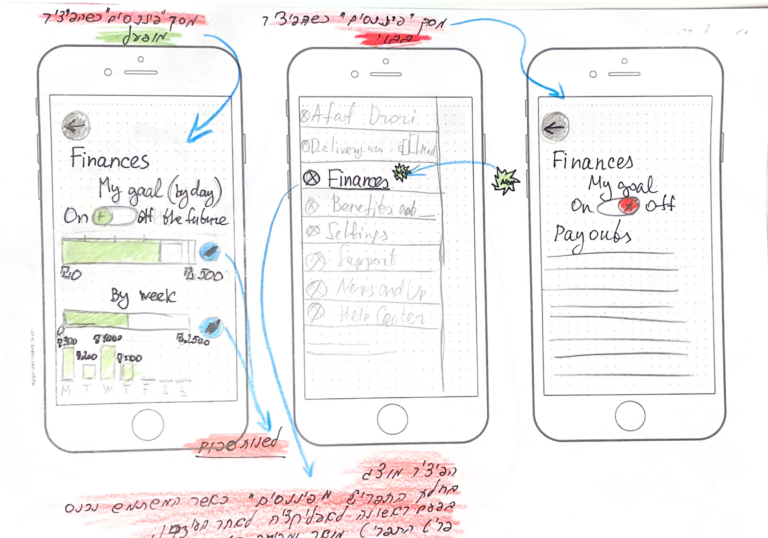
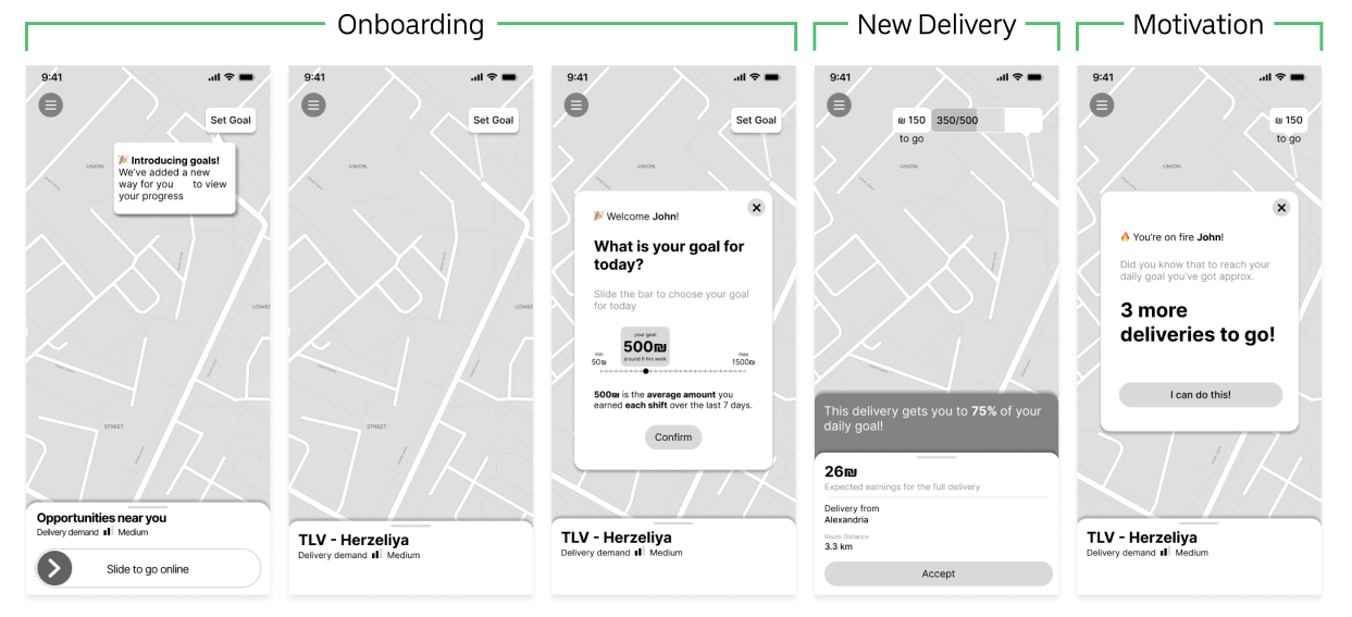
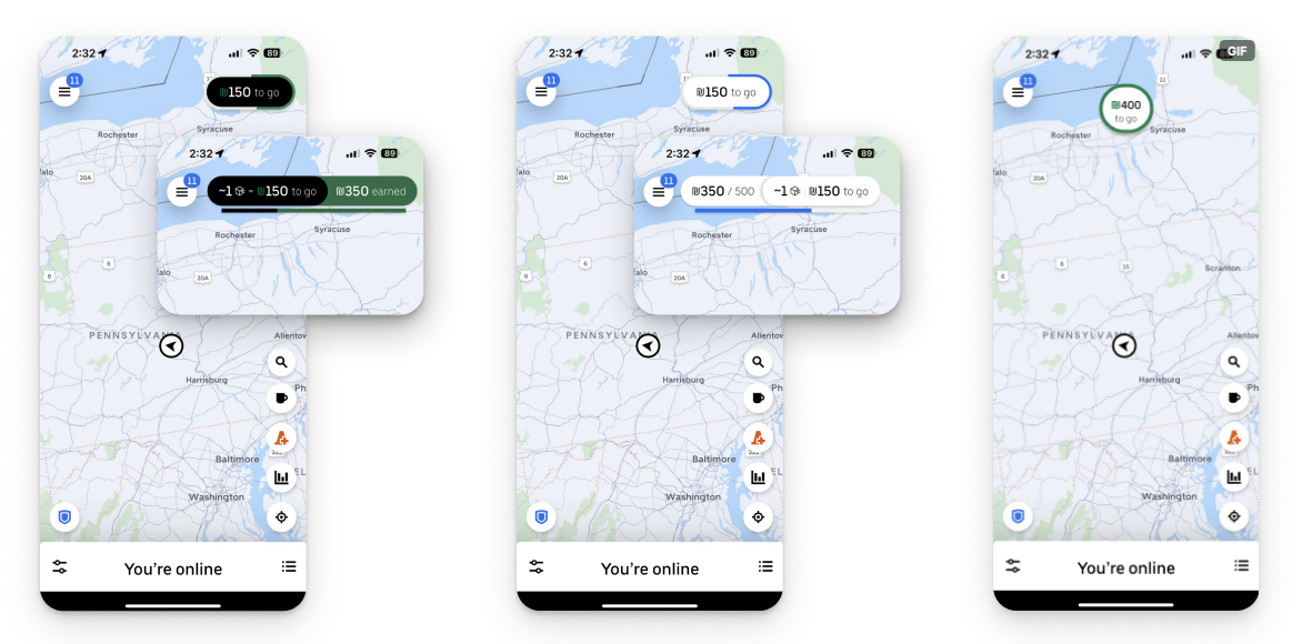
To better understand couriers’ needs, we analyzed popular financial apps (RiseU, Gridwise, Everlance) to identify best practices. Additionally, we examined courier communities on Facebook and observed their work in real time, allowing us to capture key challenges and opportunities for improvement.

2. Empathize

2.1 User Stories

Through in-depth interviews with couriers, we uncovered key pain points in their financial planning and daily earnings tracking. These insights directly shaped our feature, ensuring it addressed real user needs rather than assumptions.

2.2 Persona

Through in-depth interviews with couriers, we uncovered key pain points in their financial planning and daily earnings tracking. These insights directly shaped our feature, ensuring it addressed real user needs rather than assumptions.

3. Ideate

3.1 User Flows

To ensure a seamless experience, we mapped out user flows that guided couriers through the process of setting financial goals and tracking progress. We focused on minimizing friction, ensuring that key actions—such as goal setting and earnings review—were quick and intuitive.

3.2 Appmap

Simplified information structure was crucial to prevent overwhelming users. We designed a sitemap that organized key features logically, ensuring that couriers could easily navigate between financial planning tools, earnings insights, and goal-setting functionalities.

3.3 Sketching

Before diving into wireframes, we created low-fidelity sketches to explore layout possibilities and feature placements. This helped us validate design ideas quickly, focusing on visual clarity, interaction ease, and information hierarchy before refining the concept further.

3.4 Wireframing

We translated our sketches into low-fidelity wireframes, iterating based on feedback to refine layout, navigation, and functionality. This step allowed us to validate the core structure before moving to high-fidelity UI design.

4. Design

4.1 Design System & Runner up choices

We followed Uber’s Base Design System to ensure visual and functional consistency. Adhering to its guidelines, we maintained proper spacing, typography, and component compatibility, ensuring seamless integration within Uber’s ecosystem.

5. Test

5.1 Guerrilla usability testing

To validate our design, we created a clickable prototype and conducted guerrilla usability testing with couriers. The goal was to assess how intuitively they could navigate the feature and complete key actions.

Tested Tasks:

5.2 Usability Insights & Improvements

Based on our usability testing, we identified two key issues:

  1. The “Set Goal” button lacked visibility – Users had difficulty locating it, which led to confusion when trying to set their financial targets.
  2. Progress tracking was not intuitive – Users struggled to find a way to check their progress within the feature.

To address these issues, we refined the UI by enhancing the button’s visibility and improving the progress bar’s accessibility, ensuring a smoother and more intuitive user experience.

6. Feature Challenges & Success Metrics

6.1 The feature’s challenges

Unrealistic goals

May cause sense of failure or discouragement from working next shift

Motivational ‘sweet spot’

Balance between not motivating enough or irritating the user

6.2 The feature’s measures of success

How many users:

  • Define their goal
  • Reuse the feature
  • Are regular users

The feature’s effect on:

  • Number of times they reach the goal
  • Hourly rate – efficiacy